New wayfinding system with a fresh look coming to St. B

Visitors and staff at St. Boniface Hospital will soon be able to get around the site a little easier with new signage and colour-coded zones, as part of a hospital-wide wayfinding project.
“We want patients to get to their appointments easily, and help people find exits, and different rooms throughout the hospital more quickly,” said Senior Corporate Affairs and Engagement Officer Paul Turenne.
SBH has hired Fathom Studio, based in Nova Scotia, to design the new signage and wayfinding system. The company has done similar projects for the University of Manitoba campus, and national parks across Eastern Canada, among others.
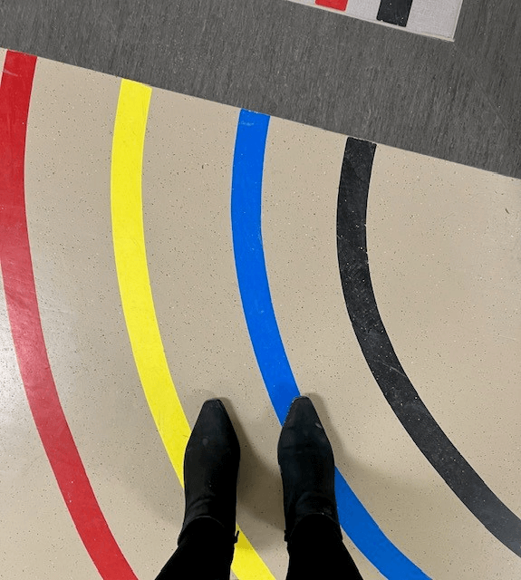
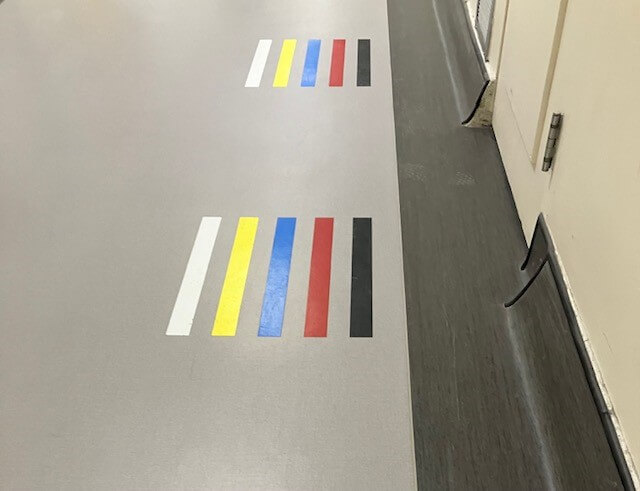
Turenne said directional signs inside the main hospital, including the floor graphics, are getting a new look. One of the more noticeable changes will likely be the use of zones.
“We’re very likely going to be adopting zones throughout the hospital, where the hospital campus will be split into zones, so basically a new look with new symbols,” Turenne said, adding that room numbers will not be changing.
Each zone is expected to have a name with a symbol to make them easier to read.
“The ones we had drafted so far were Evergreen Forest, Golden Wheat, and Red Leaf for example, but this may change as this is all preliminary right now,” Turenne said.
A wayfinding committee at SBH was recently appointed, with representation from different work areas of the hospital to oversee the project’s signage, floor decals, and “super” graphics.
“We have people from volunteer services, we have screeners, we have someone from housekeeping, clinical units, capital planning,” Turenne said.
The committee did a workshop with Fathom Studio back in January looking into things like some of the trouble spots at the hospital where people typically get lost; identification of the most common destinations; common routes people take from one point to another within the hospital, and other such background information. That research has helped in the design process and will help improve a patient’s experience.
“The issue of getting lost comes up often, sometimes even in safety huddles. We have heard of patients missing appointments because they can’t find their way, or people with health problems arriving at an appointment out of breath and we don’t want that,” Turenne said.
The new wayfinding system will also be designed to encourage people to use “preferred routes” to get them where they need to go more efficiently.

“Some of our buildings are connected,” Turenne said. “So instead of cutting through an inpatient unit to get from one building to another, the signs may direct people to go in a certain direction using the main floor, or up an elevator.”
Turenne said the project will also include braille signs in some locations for visually impaired patients.
The final design will be unveiled later this Spring. The installation of the new signs and graphics will be done in phases, with the first one set to begin in the second half of 2023. The first phase includes the interior of the main hospital’s atrium, hallways, elevator banks and staircases, as well as the tunnels to the West Block buildings like McEwen and Asper.
“We recognize the signs right now are all from different vintages, and different eras, but we are working on updating them, making them more accessible, to help get people where they need to be.”


